Project Overview
Propertybuyer
"On your side since 2001"
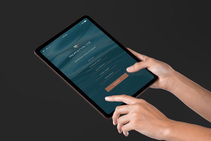
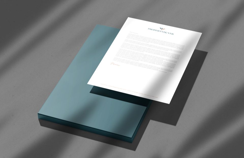
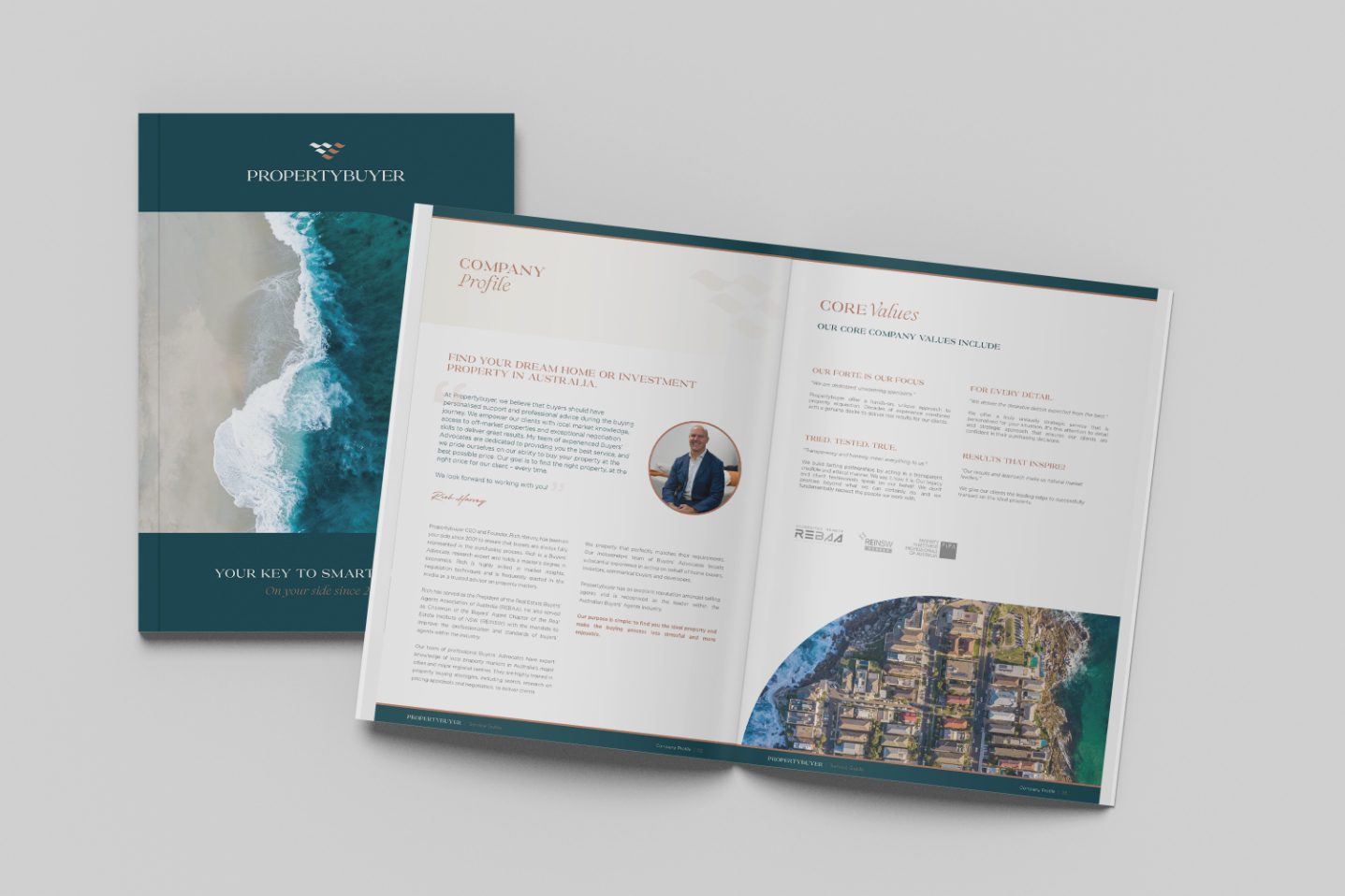
Goal To create an elevated brand that better represents the quality of service provided by the Propertybuyer team. Being Australia's number one buying agency, we wanted to restructure the brand architecture to be a branded house model, so the localised teams are better represented in their specialised service areas. This transformation also required simplifying and creating uniformity across all printed parts and to provide a seamless customer journey in all digital touchpoints.
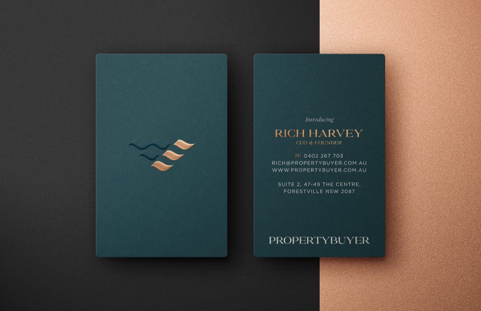
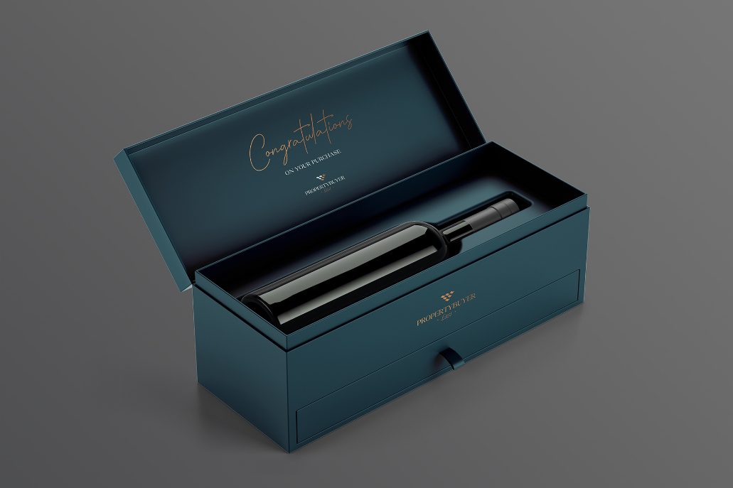
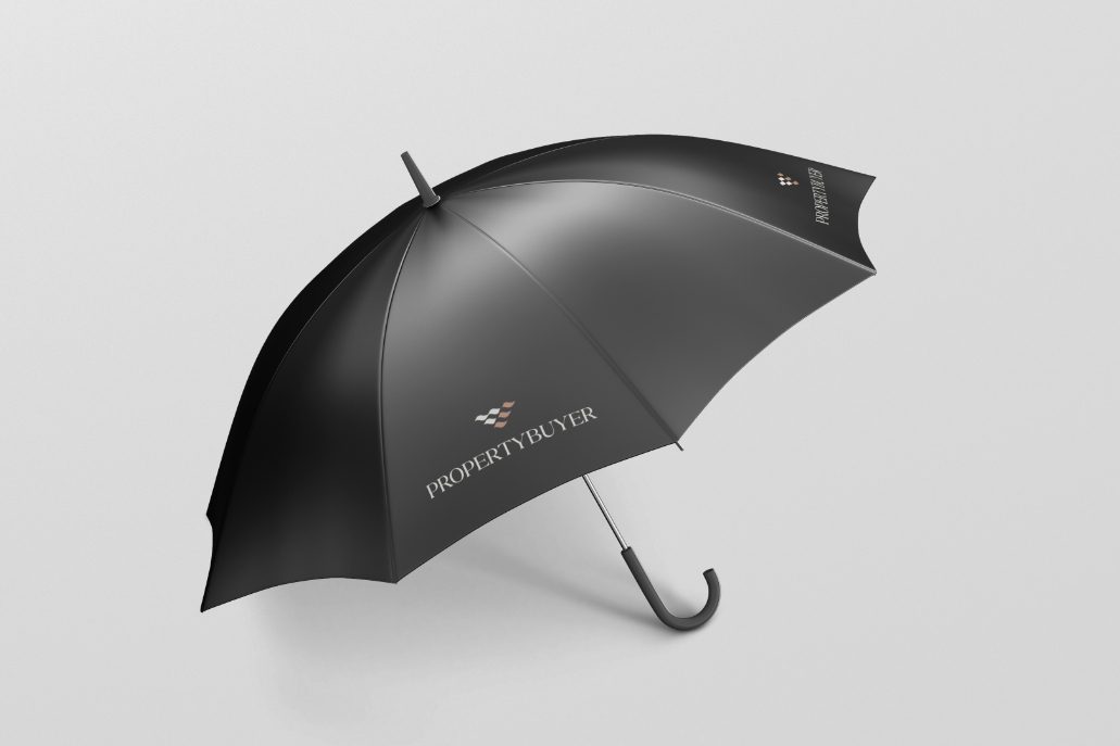
Answer We restructured Propertybuyer’s brand architecture and provided them with a master brand and localised sub brands for each office location. We crafted a new elevated typography, logomark complemented by a distinctive colour palette of forest green, soft cream and copper for embellishments that emulate the sand and sea which are an iconic benchmark for a brand that stretches the east coast of Australia.
What We Did
* Brand Identity
* Brand Strategy
* Website Design
* Digital Marketing
* Content Creation
* Website UI and UX
* Marketing Campaigns
* Apparel and Merchandise
* Online Reputation Management


